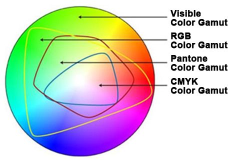
We send color concepts via email to clients for approval before producing any custom project. When they see the final version we sometimes hear them remark, “But it looked so much brighter on my monitor.” Why is that? It has to do with the different way your monitor produces color versus a digitally printed image. They have a different “color gamut”.
What is color gamut? In layman’s terms it is the difference between what the eye can see, what your monitor can reproduce using RGB and illuminated color, and what the printer can do using subtractive color and reflective light. This is very important to understand when speaking with your clients because it gives everyone involved proper expectations going into a project on what is really available and how it will turn out. What follows is a technical Wikipedia description and the movie link gives you a simple visual look at color gamut and how it works.

“In color theory, the gamut of a device or process is that portion of the color space that can be represented, or reproduced. Generally, the color gamut is specified in the hue–saturation plane, as a system can usually produce colors over a wide intensity range within its color gamut; for a subtractive color system (such as used in printing), the range of intensity available in the system is for the most part meaningless without considering system-specific properties (such as the illumination of the ink).
When certain colors cannot be expressed within a particular color model, those colors are said to be out of gamut. For example, while pure red can be expressed in the RGB color space, it cannot be expressed in the CMYK color space; pure red is out of gamut in the CMYK color space.
A device that is able to reproduce the entire visible color space is an unrealized goal within the engineering of color displays and printing processes. While modern techniques allow increasingly good approximations, the complexity of these systems often makes them impractical.
While processing a digital image, the most convenient color model used is the RGB model. Printing the image requires transforming the image from the original RGB color space to the printer’s CMYK color space. During this process, the colors from the RGB which are out of gamut must be somehow converted to approximate values within the CMYK space gamut. Simply trimming only the colors which are out of gamut to the closest colors in the destination space would burn the image. There are several algorithms approximating this transformation, but none of them can be truly perfect, since those colors are simply out of the target device’s capabilities. This is why identifying the colors in an image which are out of gamut in the target color space as soon as possible during processing is critical for the quality of the final product.”
For more information on the different aspects of graphics visit our faq’s page here,


