Color is one of the most important things to pay attention to when designing. It can make or break your message by letting your materials sing out to the audience and make them develop confidence in your brand. Thus, you must know how to use colors and how to stir them all together to create marketing magic for your brand.
Humans have an emotional reaction to colors. Communicating effectively relies on understanding that connection and banking on it to make sure you are getting the right message across. Use the color in your design to make your customers feel safe, trusting, or even hungry.
Understanding The Color Wheel And Its Usefulness In Design
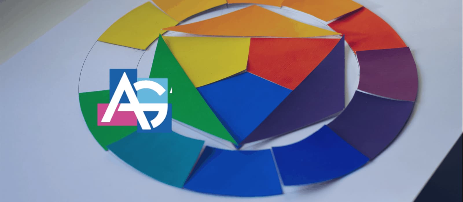
The color theory is incomplete without mentioning the color wheel. Colors are divided into three main categories for design. The primary color is the base and it consists of red, blue, and yellow. The primary color is the building block for the next tier, the secondary color. The secondary color consists of green, purple, and orange. The primary and secondary colors are the recipe for the six tertiary colors. Once you’ve got all the 12 colors, you can keep track of these distinct sets of colors by spinning them around in a wheel.Take Your Colors For A Spin!
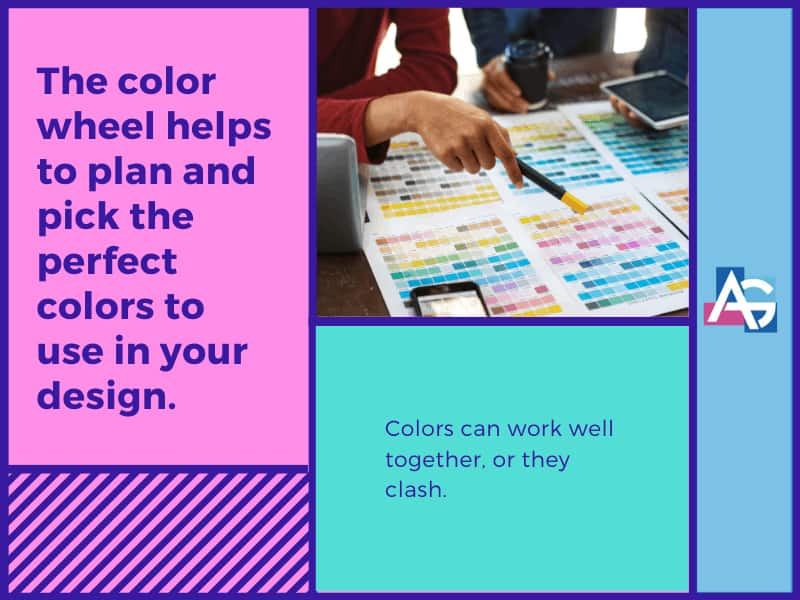
The color wheel helps to plan and pick the perfect colors to use in your design. Colors can work well together, or they clash. Finding colors that match is more systematic than you may think. Some colors work perfectly well to communicate your message with style to your customers.
Below are the different form of color combination you can use in your design:


