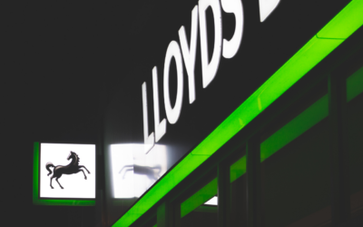
Typography is a crucial element in designing effective business signage with fonts. It is an art and technique that involves arranging type to enhance readability and visual appeal. The font chosen for signage can greatly impact a business’s visual identity and ability to stand out from competitors. By carefully considering typography principles, such as selecting fonts that reflect the brand’s personality and ensuring readability, businesses can create high-quality signage that captures attention and leaves a lasting impact on potential clients.
Importance of Typography in Business Signage
The importance of typography in business signage becomes evident when considering its role in establishing a brand’s visual identity and effectively communicating its message to potential customers. Typography trends in business signage are constantly evolving, with new fonts and styles emerging to reflect the changing design landscape. Case studies on successful typography in signage have shown that the right choice of font can significantly impact a brand’s perception and customer engagement. The psychological impact of typography in signage cannot be underestimated. Different fonts evoke different emotions and associations, and businesses can leverage this to create a desired brand image. For example, a bold and modern font may convey a sense of innovation and forward-thinking, while a classic serif font may evoke a sense of tradition and reliability. However, there are also typography mistakes to avoid in business signage. Using too many fonts or combining incompatible fonts can create a cluttered and confusing message. Poor legibility due to overly decorative or small fonts can also hinder effective communication with customers. To design effective signage, it is important to use typography tools and resources. These include font libraries, graphic design software, and online resources that provide inspiration and guidance for choosing the right fonts and creating visually appealing signage.
Principles for Effective Typography Design
Effective typography design for business signage requires careful consideration of various principles and techniques to ensure the message is visually appealing and easily understood by the target audience. Keeping up with the latest typography trends is essential to create signage that feels modern and relevant. Understanding font psychology is also crucial, as different fonts evoke different emotions and perceptions. Typography hierarchy is another important principle to consider, as it helps guide the viewer’s eye and prioritize the information presented. By using different font sizes, styles, and weights, you can create a clear hierarchy that highlights the most important elements. Typography contrast is another powerful technique that can make your signage stand out. By combining fonts with contrasting characteristics, such as serif and sans-serif, or bold and light, you can create visual interest and enhance readability. Additionally, color plays a significant role in typography. Choosing harmonious color palettes that complement the font and overall design can help create a cohesive and visually pleasing signage. By applying these principles, you can ensure that your typography design effectively communicates your message and captivates your target audience.
Choosing the Right Fonts for Business Signage
When selecting fonts for business signage, it is important to consider their impact on the overall message and visual appeal. Font psychology plays a significant role in evoking specific emotions in business signage. Different fonts have the power to convey professionalism, trustworthiness, creativity, and more. It is crucial to choose fonts that align with the brand’s personality and the emotions it wants to evoke in its target audience. Typography trends are constantly evolving, and it is essential to stay updated on the latest font styles and designs for impactful signage. Experimenting with new and innovative fonts can help businesses create eye-catching and memorable signage that stands out in a crowded marketplace. Font pairing is another important aspect to consider when designing business signage. Combining fonts that complement each other can create visually appealing and cohesive signage. It is recommended to choose fonts that have contrasting characteristics such as a mix of serif and sans-serif or bold and light fonts. Legibility factors must also be taken into account when selecting fonts for business signage. Factors like font size, spacing, and line height can significantly affect the readability of the signage. It is crucial to choose fonts that are easily legible from a distance and in different lighting conditions. For businesses looking to establish a unique visual identity, custom font creation is an option worth exploring. Designing a unique font for business signage provides the opportunity to create a font that perfectly aligns with the brand’s personality and message. It allows businesses to differentiate themselves and create a distinct and recognizable visual identity.
Benefits of Incorporating High-Quality Typography in Signage
Incorporating high-quality typography in signage enhances a business’s visual identity and effectively communicates its message to potential customers. The impact of typography on brand perception cannot be understated. The choice of fonts has the power to shape how customers perceive a brand. A well-designed and carefully selected font can convey professionalism, creativity, and trustworthiness, while a poor choice can have the opposite effect. Typography has the ability to enhance the visual appeal of signage. By using fonts that are visually pleasing and aesthetically pleasing, businesses can attract attention and make a memorable impression on customers. Typography is not just about making signage look attractive; it is also a tool for effective communication. The right combination of fonts, sizes, and spacing can make a message stand out and be easily understood. It can evoke emotions, create a sense of urgency, or convey important information. Understanding the psychology of typography in signage is crucial. Different fonts have different connotations and associations. Serif fonts, for example, are often associated with tradition and elegance, while sans-serif fonts are seen as modern and clean. By choosing fonts that align with the brand’s personality and message, businesses can create a more cohesive and impactful visual identity. Lastly, it is important to stay updated with typography trends in modern business signage. Trends in typography change over time, and businesses need to adapt to stay relevant and appealing to customers. By incorporating current typography trends, businesses can show that they are up-to-date and in touch with the latest design aesthetics. High-quality typography in signage offers numerous benefits to businesses. It enhances brand perception, enhances visual appeal, facilitates effective communication, taps into the psychology of typography, and keeps up with modern trends. By paying attention to typography, businesses can create signage that not only looks good but also effectively communicates their message and attracts customers.
Sealing the Deal with Typography: Partner with Attention Getters for Signage that Speaks Volumes
Typography is not merely a component of design; it is the voice of your brand made visible. A well-crafted sign can speak volumes, drawing in customers and communicating your company’s values before a single word is spoken. As we’ve seen, the right font selection can elevate your business’s presence and leave an indelible mark on the minds of your clientele. Attention Getters, an online business signage company, understands the power of this visual communication and stands ready to transform your typographic vision into a business signage reality. With cutting-edge tools and a finger on the pulse of the latest design trends, we invite you to partner with us to craft signs that do more than inform—they inspire. Visit our website to explore our services and let Attention Getters help you create the perfect typographic sign that represents the very best of your brand.


